Red Navy
15.2 cm by 15 cm
Perry Devlin
Photoshop Painting
9/17/2015
Box art for "The Soviet Experience"
|
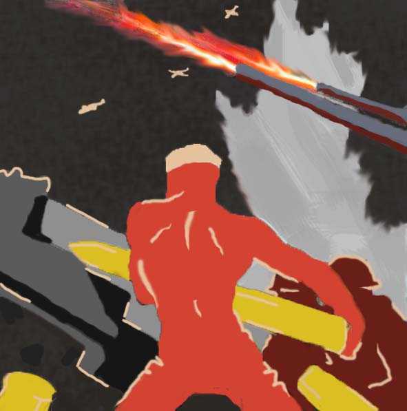
I mainly really wanted to make a propaganda piece for my first project. The original idea was to just create a US Navy inspired piece. However, more planning had me think of the idea to make a Navy piece in the style of Soviet propaganda. I was originally going to try a block print also, but that ended up being way too complicated and very time consuming. I would've had to do multiple layers on one print with different colors. I would have had to care out from the linoleum in a specific order, and tape up the already printed areas. I did start that process, but it did not go well. needless to say, I went with my comfort zone and did a digital painting instead.
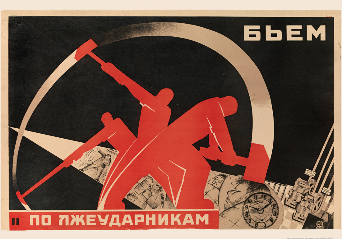
As you can see, I obviously did a bit of copying, which was indeed the intent. I wanted to go after the art movement who also created a piece after one famous artist piece. I wanted to do what he did in the way that he took already made art, but put his own touches on it to make it his. He did get in trouble for it, which I hope I don't, but it was good inspiration. I did take Liberty (1942) and simply added the Soviet style to it. It is clearly much more red with less detail and quick white outlines for the figures.
I made the background much more simple, with just two main colors: gray and black. The figures are clearly red instead of realistic, with tan outlines on the most noticeable contours of the body. Everything in the painting is very simplistic compared to the original painting. In that way I succeeded, though I am not incredibly happy with the result.
|
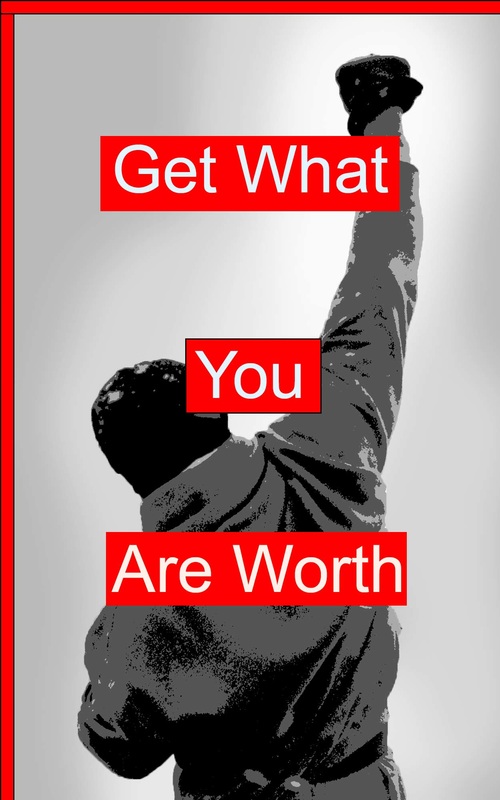
Get What You Are Worth
43.9 cm by 70.3 cm
Perry Devlin
Photoshop
9/23/2015
Untitled (We don’t need another hero), 1987
|
|
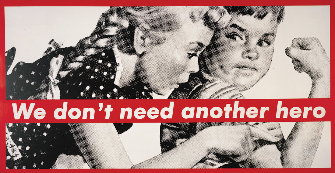
In order do make it look more like Barbara Kruger's work, I had to change quite a bit of the picture. I had to mainly make it black and white, as well as change the contrast of the work. The "noise" had to be increased in order to make the separate shadow effect and make the "color fields", which create even more contrast in the piece.
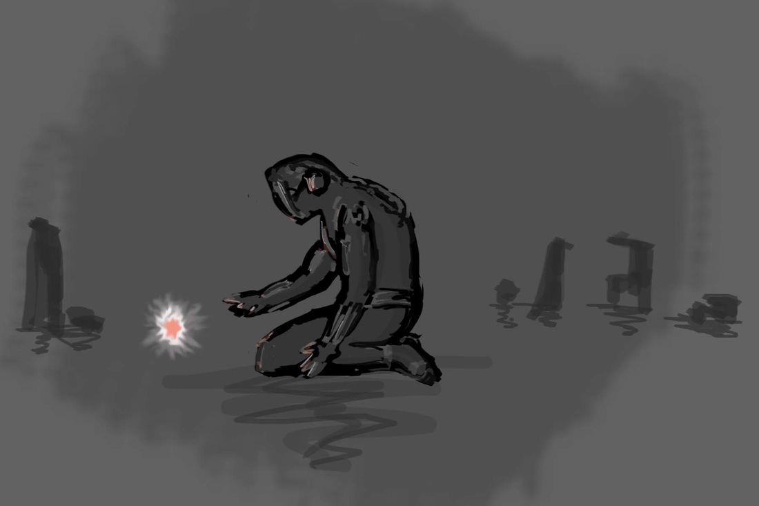
Follow the Hope
15.24 cm by 10.16 cm
Photoshop Painting
10/20/2015
|
This is another one of my pieces that are directly related to rough sketches, or concept art. The meaning is clear, in my eyes, when looking at this piece. As for my style of art, I was looking at contemporary illustration in order to complete this piece. I meant for this piece to be a bit ragged and obviously dark (color-wise). I wanted to portray a sense of hopelessness in this piece. I personally have never felt that, but I know many who have, which has effected me personally due to our closeness.
The light is supposed to represent hope, and the man is clearly suffering in some way. You can tell his mood from the slouched and kneeling posture that he has. He is clearly reaching for the "hope", which in this case is an animate object. I mainly wanted to show the simplistic side of art, whereas it can look good and be very "bland" at the same time. I think I succeeded in that way, because I think the painting turned out very well. I tried making it sketch-like and dark in order to show the darker side of things, and also make the light, or "hope", stand out much more. The contrast is a large part of this painting, and I think that it wouldn't be the same without the large amount of it.
The reason I chose to do the background nearly empty except for a few "buildings" is to add to the empty and hopeless feeling. The buildings are just silhouettes of a broken city, or what could have been. While the main figure does seem sci-fi, and that is what I wanted to do, he is more than just a man with a mask. He is someone who is lost, and lost on a distant planet. That empty, dead planet can once again be connected to the theme of hope in this piece.
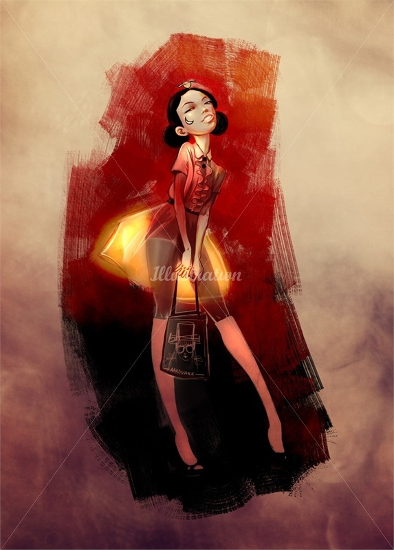
The piece to the right (please excuse the water mark) is the piece that inspired me to make what I made. This piece is very disproportionate and colorful, with a happier vibe to it. Granted, this is character design and mine is not, I still wanted to take the general style of the piece from it. Contrary to this paining, mine is much darker and sad, as I have talked about before. I used dark colors only compared to the bright colors of Aardvark's piece. I loved the simplistic background, so I made my background simplistic also. I took the disproportionate style from this also, though not quite as extreme. Another similarity is that both mine and Aardvark's has a area that glows. The part in mine that glows is the small sense of hope, whereas in my inspiration's piece, it's the skirt. Two rather different things in that sense, but a similarity in a more simplistic way.
|
Untitled Character Design
|
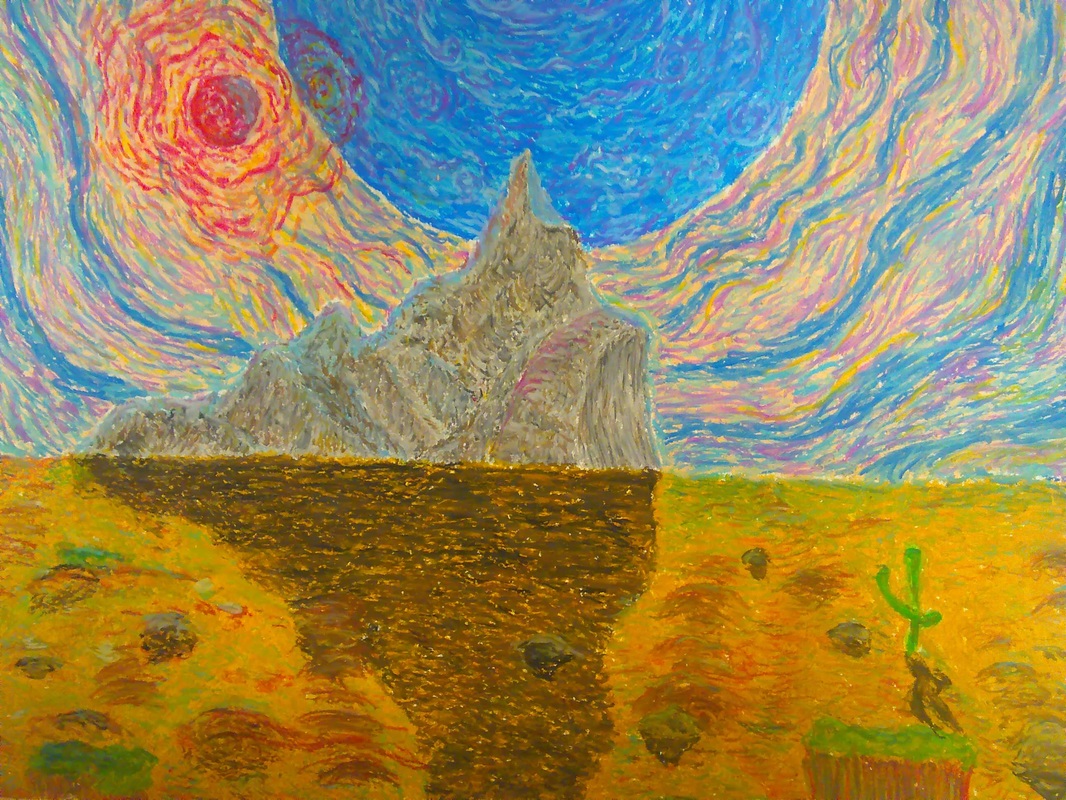
Wolf-Rayet Planet
17.75 cm by 12 cm
Oil Pastels on Paper
11/15/2015
|
This piece was created due to the fact that I love oil pastels. I loved the landscape painting from freshman year art, and I wanted to do it again to see how much I could improve. To cut to that direction, I feel like I improved quite a bit, and I am very happy about that.
I wanted to have some surreal aspects of the painting, mainly due to the fact that it is made with oil pastels, and I felt obligated to. The main direction I was going for was impressionism. The entire piece should look very good, and I was actually going for as little meaning as possible to show that fine art can still be fine art without a deeper meaning. To succeed with this premise, I really had to focus on the way I made this; the strokes, colors and techniques were all very important to this piece. I was thinking that since fine art is very meaning heavy, in order to compensate for my lack of meaning, I had to really focus on techniques and looks.
|
|
The one and only thing that I feel really stands out as wrong is the fact that the blue sun is clearly enormous, yet the ground in yellow. I noticed this half way through the ground, and tried to fix it afterwords... I didn't fully succeed. I tried adding a blue tint to the top layer, but the yellow and brown was way to thick and dominant. That was quite a failure.
The final product had multiple layers and many different colors, as you can see to the right. The ground was definitely the longest to complete. I had to try to create depth in a desert setting, which is a hard thing to do. That is the main reason why I added rocks and hills and some shrubbery, because without it, I was not able to create depth to show the distance. The depth is somewhat noticeable, and would be more so if I figured out how to successfully paint the mountains shadow. The shadow was definitely hard for me, because only the tip is covering the sun, so I didn't know how far the shadow should be down the paper. I decided to see how it would would with it barely reaching the bottom of the paper, but I don't believe that was the right choice. The shape and shadow distortion is completely off also; it should be more bumpy and "bendy". I am happy with the rest of the painting, besides those two points.
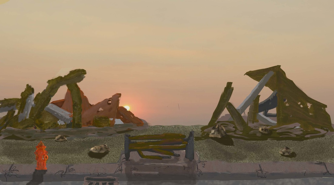
Desolation
22.86 cm by 12.7 cm
Photoshop Painting
11/30/2015
Untitled Landscape
|
This was one of my favorite pieces to make, as it was made on Photoshop from scratch. I had two main areas of inspiration. While looking at illustrations and contemporary art landscapes, I found a piece by Michael Frith. I loved how his "brushstrokes" looked: rather sketch-like, yet very vibrant. You can see how rough the strokes are, and I put that same style into my artwork. The other piece I was inspired by was actually concept art for Fallout 3 by one of my favorite artists Adam Adamowicz. I wanted the same natural style from Fritz with the wasteland setting of Adamowicz.
This process took a very long time, and I had to learn a couple new things in order to complete this piece. I really had to create the rugged feel of the wasteland in Fallout 3, with the type of brushstrokes in Frith's piece. The combination of the two was quite difficult to get right, but very fun to do.
I tried to have a sense of balance in this piece, while also having a sense of movement. There are two clear building in the background on either side of the "canvas", and they are both leaning a bit to the right. The reason for that is because I was going for a "post nuclear war" vibe, with everything destroyed and run down and grungy. The concept art from Adamowicz is obviously discolored, with the main colors being grey and tan/brown. I used that same color palette for my piece, with some added colors of course (red fire extinguisher, blue-ish sky).
There is a bit of meaning behind this piece, which is hidden behind the clear picture of how destruction looks. Obviously everyone knows what the remains of a disaster can look like, but I wanted to make the "client" think about what happened in my piece. I was going for post nuclear war, which is always a possibility in the world. This piece is a sequel to a disaster that is a very real possibility.
|
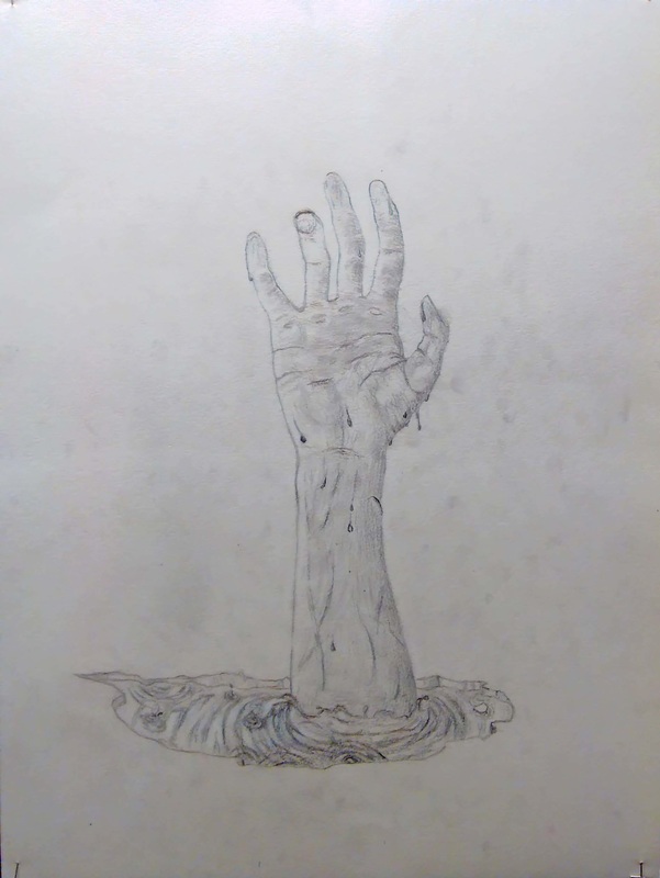
Break on Through
Pencil on Paper
12/20/2015